9.7 KiB
9.7 KiB
css基础
类型
内部, 外部, 行内
内部
<!DOCTYPE html>
<html>
<head>
<style>
body {
  background-color: linen;
}

h1 {
  color: maroon;
  margin-left: 40px;
}
</style>
</head>
<body>

<h1>This is a heading</h1>
<p>This is a paragraph.</p>

</body>
</html>
外部
<!DOCTYPE html>
<html>
<head>
<link rel="stylesheet" type="text/css" href="mystyle.css">
</head>
<body>

<h1>This is a heading</h1>
<p>This is a paragraph.</p>

</body>
</html>
行内
<!DOCTYPE html>
<html>
<body>

<h1 style="color:blue;text-align:center;">This is a heading</h1>
<p style="color:red;">This is a paragraph.</p>

</body>
</html>
css 的三大特性
- 层叠性
- 继承性:
text-,font-,line-这些元素开头的可以继承,以及color属性 - 优先级
选择器优先级计算表格:
- 从左到右
- 有4位, 但不会进级
| 选择器 | 权重 |
|---|---|
| 继承或者* | 0,0,0,0 |
| 元素选择器 | 0,0,0,1 |
| 类选择器, 伪类选择器 | 0,0,1,0 |
| id选择器 | 0,1,0,0 |
| 行内式 | 1,0,0,0 |
| !important | 无穷大 |
例子:
div ul li   0,0,0,3
.nav ul li  0,0,1,2
a:hover     0,0,1,1
.nav a      0,0,1,1
选择器
- 基础选择器
- 标签选择器
- 类选择器
- id选择器
- 通配符选择器:
*
- 复合选择器
- 后代选择器
:nth-of-type(n)和:nth-child(n): nth-of-type 除了要符合顺序, 还得符合类型
- 子代选择器
- 并集选择器
- 伪类选择器
- 链接伪类选择器
:link,:visited,:hover,:active, 为了生效, 需要注意顺序 :focus获得焦点的表单元素:is(selector1, selector2, selector3)符合其中一种:not(selector)选择不匹配指定选择器的元素:has(selector)包含特定子元素的父元素, 或者包含特定兄弟元素的元素:root选择文档的根元素:empty选择没有任何子元素的元素
- 链接伪类选择器
- 兄弟选择器
- 相邻兄弟选择器:
p + span紧跟在 p 后面的第一个 span - 通用兄弟选择器:
p ~ spanp 后面的所有 span
- 相邻兄弟选择器:
- 后代选择器
字体属性
font: font-style font-weight font-size/line-height font-family;
使用 font 属性时,必须按上面语法格式中的顺序书写,不能更换顺序,并且各个属性间以空格隔开 不需要设置的属性可以省略(取默认值),但必须保留 font-size 和 font-family 属性,否则 font 属性将不起作用
- font-style: normal / italic
- font-weight: normal是400, blood是700
文本属性
- 修饰文本 text-decoration: none / underline / overline 上划线 / line-through 删除线
- 文本缩进: text-indent: 单位可以是px, 或者是em, em是当前元素一个文字的大小
块级/行内/行内块
块级元素
- 常见的块级:
<h1>~<h6>、<p>、<div>、<ul>、<ol>、<li>
特殊: p标签里面不能放块级元素
行内元素
- 常见的行内:
<a>、<strong>、<b>、<em>、<i>、<del>、<s>、<ins>、<u>、<span>
特殊: a标签里面可以放块级元素
行内块元素
- 常见的行内块元素
<img />
<input />
<button >
<textarea>
<select>
<video>
<audio>
转化
- 转换为块元素:display:block;
- 转换为行内元素:display:inline;
- 转换为行内块:display: inline-block;
单行文字垂直居中
行高等于盒子的高度
border
- 边框合并
border-collapse:collapse; - border影响盒子大小
margin
- 块级盒子水平居中: 1. 盒子设置宽度, 左右外边距设置auto
- 相邻元素垂直外边距的合并
- 嵌套元素垂直外边距的塌陷
传统网页布局
- 标准流
- 浮动
- 定位
浮动
浮动的元素不会压住文字, 一开始就是设计用来展示新闻的
- 脱离标准流;
- 浮动的元素会一行内显示并且元素顶部对齐
清除浮动
- 为什么要清除浮动:
由于父级盒子很多情况下,不方便给高度,但是子盒子浮动又不占有位置,最后父级盒子高度为 0 时,就会影响下面的标准流盒子。
如果父盒子本身有高度,则不需要清除浮动
- 清除浮动策略
闭合浮动. 只让浮动在父盒子内部影响,不影响父盒子外面的其他盒子.
- 如何清除浮动:
给父元素添加 clearfix类名, 然后添加样式
/*单伪清除浮动*/
.clearfix::after {
  content: '';
  display: block;
  height: 0;
  visibility: hidden;
  clear: both;
}
 /*双伪清除浮动*/
 .clearfix:before,.clearfix:after {
 content:'';
 display:table;
 }
 .clearfix:after {
 clear:both;
 }
定位
静态定位 static
没有定位
相对定位 relative
- 相对自己原来的位置移动
- 原来的位置继续占有
- 经典作用是给绝对定位当爹
绝对定位 absolute
===子绝父相===
- 移动时是相对祖先元素
- 脱离标准流, 不占有原来的位置
- 没有祖先元素, 以Document为基准
固定定位 fixed
- 以浏览器的可视窗口为参照点移动
- 不随页面的滚动而移动,始终保持在视口中的指定位置
- 脱标, 不占有原来位置
粘性定位 sticky
- 以浏览器的可视窗口为参照点移动
- 根据页面滚动动态切换为相对定位和固定定位
- 占用原来位置
应用
- 固定在版心右侧
- 固定定位 left 50%
- margin-left 版心的一半
<style>
	.w {
		width: 800px;
		height: 1400px;
		background-color: pink;
		margin: 0 auto;
	}
	.fixed {
		position: fixed;
		/* 1. 走浏览器宽度的一半 */
		left: 50%;
		/* 2. 利用margin 走版心盒子宽度的一半距离 */
		margin-left: 405px;
		width: 50px;
		height: 150px;
		background-color: skyblue;
	}
</style>
</head>
<body>
    <div class="fixed"></div>
    <div class="w">版心盒子 800像素</div>
</body>
- 绝对定位的盒子居中
- left 50%
- transform: translateX(-50%)
css书写顺序
建议遵循以下顺序:
- 布局定位属性:display / position / float / clear / visibility / overflow(建议 display 第一个写,毕竟关系到模式)
- 自身属性:width / height / margin / padding / border / background
- 文本属性:color / font / text-decoration / text-align / vertical-align / white- space / break-word
- 其他属性(CSS3):content / cursor / border-radius / box-shadow / text-shadow / background:linear-gradient …
举例:
 .jdc {
    display: block;
    position: relative;
    float: left;
    width: 100px;
    height: 100px;
    margin: 0 10px;
    padding: 20px 0;
    font-family: Arial, 'Helvetica Neue', Helvetica, sans-serif;
    color: #333;
    background: rgba(0,0,0,.5);
    border-radius: 10px;
 }
vertical-align
文字图片水平对齐: middle
vertical-align : baseline | top | middle | bottom
溢出文字省略号
单行文本
/*1. 先强制一行内显示文本*/
white-space: nowrap;  ( 默认 normal 自动换行)

/*2. 超出的部分隐藏*/
overflow: hidden;

/*3. 文字用省略号替代超出的部分*/
text-overflow: ellipsis;
多行文本
/*1. 超出的部分隐藏 */
overflow: hidden;

/*2. 文字用省略号替代超出的部分 */
text-overflow: ellipsis;

/* 3. 弹性伸缩盒子模型显示 */
display: -webkit-box;

/* 4. 限制在一个块元素显示的文本的行数 */
-webkit-line-clamp: 3;

/* 5. 设置或检索伸缩盒对象的子元素的排列方式 */
-webkit-box-orient: vertical;
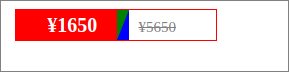
京东三角
<!DOCTYPE html>
<html lang="en">
    <head>
        <meta charset="UTF-8">
        <meta name="viewport" content="width=device-width, initial-scale=1.0">
        <meta http-equiv="X-UA-Compatible" content="ie=edge">
        <title>CSS三角强化的巧妙运用</title>
        <style>
            .price {
                width: 160px;
                height: 24px;
                line-height: 24px;
                border: 1px solid red;
                margin: 0 auto;
            }
            .miaosha {
                position: relative;
                float: left;
                width: 90px;
                height: 100%;
                background-color:red;
                text-align: center;
                color: #fff;
                font-weight: 700;
                margin-right: 8px;

            }
            .miaosha i {
                position: absolute;
                right: 0;
                top: 0;
                width: 0;
                height: 0;
                border-color: transparent #fff transparent transparent;
                border-style: solid;
                border-width: 24px 10px 0 0;
            }
            .origin {
                font-size: 12px;
                color: gray;
                text-decoration: line-through;
            }
        </style>
    </head>
    <body>
        <div class="price">
            <span class="miaosha">
                ¥1650
                <i></i>
            </span>
            <span class="origin">¥5650</span>
        </div>
    </body>
</html>
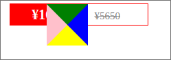
.miaosha i {
    position: absolute;
    right: 0;
    top: 0;
    width: 0;
    height: 0;
    border-color: green blue yellow pink;
    border-style: solid;
    border-width: 24px 24px 24px 24px;
}
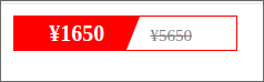
/** 让border左下宽度为0,*/
.miaosha i {
    position: absolute;
    right: 0;
    top: 0;
    width: 0;
    height: 0;
    border-color: green blue yellow pink;
    border-style: solid;
    border-width: 24px 24px 0 0;
}