798 lines
19 KiB
Markdown
798 lines
19 KiB
Markdown
# css 3
|
||
|
||
## 属性选择器
|
||
|
||
```css
|
||
intput[type="text"]{}
|
||
```
|
||
|
||
| 选择器 | 功能描述 |
|
||
| ------------------ | -------------------------- |
|
||
| E[attribute] | 选取带有指定属性的元素 |
|
||
| E[attribute=value] | 选取带有指定属性和值的元素 |
|
||
| E[attr^="val"] | 匹配属性attr的值以指定值"val"开头的每个元素 |
|
||
| E[attr$="val"] | 匹配属性attr的值以指定值"val"结尾的元素 |
|
||
| E[attr*="val"] | 匹配属性attr的值包含字符串"val"元素 |
|
||
|
||
## 结构伪类选择器
|
||
|
||
| 选择器 | 功能描述 |
|
||
| ---------------- | ------------------------------------------------ |
|
||
| E:fisrt-child | 选择位于其父元素中第一个位置,且匹配E的子元素 ,与E:nth-child(1)等同 |
|
||
| E:last-child | 选择位于其父元素中最后一个位置,且匹配E的子元素 ,与E:nth-last-child(1)等同 |
|
||
| E:nth-child(n) | 选择所有在其父元素中的**第n个**位置的匹配E的子元素 |
|
||
| E:first-of-type | 选择在其父元素中匹配E的第一个同类型子元素 |
|
||
| E:last-of-type | 选择在其父元素中匹配E的最后一个同类型子元素 |
|
||
| E:nth-of-type(n) | 选择所有在其父元素中**同类型第n个**位置的匹配E的子元素 |
|
||
|
||
* n从零开始递增,2n表示偶数, 2n+1表示奇数, n+5表示从第五个开始, -n+5表示前5个
|
||
* 不能写5-n或者5+n, n 在前, +号省略表示往右, -号表示往左
|
||
* **nth-child 和 nth-of-type 的区别: nth-of-type 除了要符合顺序, 还得符合类型**
|
||
|
||
```html
|
||
<section>
|
||
<p>1</p>
|
||
<div>2</div>
|
||
<div>3</div>
|
||
</section>
|
||
```
|
||
|
||
```css
|
||
section div:nth-child(1){
|
||
background-color: red;
|
||
}
|
||
/** 没生效, 找到第一个孩子, 但不叫div,是p */
|
||
```
|
||
|
||
```css
|
||
section div:nth-of-type(1){
|
||
background-color: red;
|
||
}
|
||
/** 生效,先给叫div的孩子排序, 给序号1的设置背景色 */
|
||
```
|
||
|
||
## 伪元素
|
||
|
||
|选择器|功能描述|
|
||
|---|---|
|
||
|::before|在元素内部前面插入内容|
|
||
|::after|在元素内部后面插入内容|
|
||
|
||
注意:
|
||
|
||
* 是加在内容前后, 不是结构前后
|
||
* **必须有content值**
|
||
* 双标签才有伪元素
|
||
* 默认是行内元素
|
||
|
||
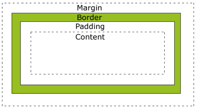
## 盒子模型
|
||
|
||
```css
|
||
box-sizing: content-box | border-box;
|
||
```
|
||
|
||
* `content-box`: 默认值, 标准盒子, with 不包含 border 和 padding
|
||
* 子元素的 width 和 height 的百分比值默认基于父元素的 内容区域(content box) 计算
|
||
* `border-box`: 怪异盒子, with 把 border 和 padding 也算进去
|
||
* 子元素的百分比值仍然基于父元素的 内容区域,而不是 border-box
|
||
|
||
|
||
|
||
### 子元素的百分比不根据父元素的 content
|
||
|
||
* 如果子元素使用视口单位(如 vw、vh),则其尺寸基于视口的宽度或高度
|
||
* 如果子元素使用 position: absolute,其百分比值基于最近的定位祖先元素(positioned ancestor) 的 padding-box
|
||
* 在 Flexbox 或 Grid 布局中,子元素的百分比值可能基于容器的可用空间
|
||
* 如果父元素使用了 `transform`,子元素的百分比值基于父元素的 **包含块(containing block)**
|
||
|
||
## calc 计算
|
||
|
||
```css
|
||
/**根据屏幕高度计算盒子最高高度*/
|
||
.box {
|
||
max-height: calc(100wh - 100rem)
|
||
}
|
||
```
|
||
|
||
* 支持 `+ - * /`
|
||
* 运算符两边必须有空白
|
||
|
||
## 变量
|
||
|
||
### 声明
|
||
|
||
声明变量的时候,变量名前面要加两根连词线(`--`)。
|
||
|
||
```css
|
||
body {
|
||
--foo: #7F583F;
|
||
--bar: #F7EFD2;
|
||
}
|
||
```
|
||
|
||
### 读取
|
||
|
||
`var()`函数用于读取变量
|
||
|
||
```css
|
||
a {
|
||
color: var(--foo);
|
||
text-decoration-color: var(--bar);
|
||
}
|
||
```
|
||
|
||
`var()`函数还可以使用第二个参数,表示变量的默认值。如果该变量不存在,就会使用这个默认值。
|
||
|
||
```css
|
||
color: var(--foo, #7F583F);
|
||
```
|
||
|
||
第二个参数不处理内部的逗号或空格,都视作参数的一部分。
|
||
|
||
```css
|
||
var(--font-stack, "Roboto", "Helvetica");
|
||
var(--pad, 10px 15px 20px);
|
||
```
|
||
|
||
`var()`函数还可以用在变量的声明
|
||
|
||
```css
|
||
:root {
|
||
--primary-color: red;
|
||
--logo-text: var(--primary-color);
|
||
}
|
||
```
|
||
|
||
`var()`只能用作属性值,不能用作属性名。
|
||
|
||
### 变量的类型
|
||
|
||
如果变量值是一个字符串,可以与其他字符串拼接。
|
||
|
||
```css
|
||
--bar: 'hello';
|
||
--foo: var(--bar)' world';
|
||
```
|
||
|
||
如果变量值是数值,不能与数值单位直接连用
|
||
|
||
```css
|
||
.foo {
|
||
--gap: 20;
|
||
/* 无效 */
|
||
margin-top: var(--gap)px;
|
||
}
|
||
```
|
||
|
||
需要使用calc
|
||
|
||
```css
|
||
.foo {
|
||
--gap: 20;
|
||
margin-top: calc(var(--gap) * 1px);
|
||
}
|
||
```
|
||
|
||
如果变量值带有单位,就不能写成字符串
|
||
|
||
```css
|
||
/* 无效 */
|
||
.foo {
|
||
--foo: '20px';
|
||
font-size: var(--foo);
|
||
}
|
||
|
||
/* 有效 */
|
||
.foo {
|
||
--foo: 20px;
|
||
font-size: var(--foo);
|
||
}
|
||
```
|
||
|
||
### 作用域
|
||
|
||
同一个 CSS 变量,可以在多个选择器内声明
|
||
|
||
变量的作用域就是它所在的选择器的有效范围
|
||
|
||
### 应用: 响应式布局
|
||
|
||
```css
|
||
body {
|
||
--primary: #7F583F;
|
||
--secondary: #F7EFD2;
|
||
}
|
||
|
||
a {
|
||
color: var(--primary);
|
||
text-decoration-color: var(--secondary);
|
||
}
|
||
|
||
@media screen and (min-width: 768px) {
|
||
body {
|
||
--primary: #F7EFD2;
|
||
--secondary: #7F583F;
|
||
}
|
||
}
|
||
```
|
||
|
||
## filter 滤镜
|
||
|
||
* 灰色滤镜: 国家哀悼日之类的
|
||
|
||
```css
|
||
* {
|
||
filter: grayscale(100%); /** 0-100*/
|
||
}
|
||
```
|
||
|
||
* 模糊
|
||
|
||
```css
|
||
img {
|
||
-webkit-filter: blur(5px); /* Chrome, Safari, Opera */
|
||
filter: blur(5px);
|
||
}
|
||
```
|
||
|
||
## transition 过渡
|
||
|
||
> 通常与 `:hover` `:active` 等状态变化一起使用
|
||
|
||
```css
|
||
transition: 过渡属性 花费时间 运动曲线 延迟时间;
|
||
```
|
||
|
||
1. 过渡和时间必须写.
|
||
2. 有多个属性用逗号隔开.
|
||
3. 属性: 高/宽/背景颜色/内外边距/...可以是all
|
||
4. 时间单位是s, 必须写, 强制是第一个
|
||
5. 运动曲线, 默认是easy, 可以省略, 常改成linear匀速
|
||
6. 延迟时间, 默认是0s, 可以省略
|
||
|
||
```css
|
||
div
|
||
{
|
||
width: 100px;
|
||
height: 100px;
|
||
transition: width 2s, height 2s;
|
||
-webkit-transition: width 2s, height 2s; /* Safari */
|
||
}
|
||
div:hover {
|
||
width:300px;
|
||
height:300px;
|
||
}
|
||
```
|
||
|
||
## transform 进行2D转换
|
||
|
||
### translate 移动
|
||
|
||
> 类似定位
|
||
|
||
```css
|
||
transform: tranlate(x, y);
|
||
/*也可以分开写*/
|
||
tranform: tranlateX(n);
|
||
tranform: tranlateY(n);
|
||
```
|
||
|
||
* translate最大的优点, 不会影响其他元素的位置
|
||
* 百分比单位是相对自身元素的. `translate: (-50%, -50%);`
|
||
* 对行内标签没有效果
|
||
|
||
应用: 和定位一起实现居中
|
||
|
||
```css
|
||
potition: absolute;
|
||
top: 50%;
|
||
left: 50%;
|
||
transform: tranlate(-50%, -50%);
|
||
```
|
||
|
||
### rotate 旋转
|
||
|
||
```css
|
||
transform: rotate(度数);
|
||
```
|
||
|
||
* 度数单位是deg
|
||
* 顺时针为正, 逆时针为负
|
||
* 以元素中心旋转
|
||
|
||
### transform-origin 设置元素转换的中心点
|
||
|
||
```css
|
||
transform-origin: x y;
|
||
```
|
||
|
||
* 默认是元素的中心点50% 50%.
|
||
* 可以是方位名词left right top bottom
|
||
|
||
### scale 缩放
|
||
|
||
```css
|
||
tranform: scale(x, y);
|
||
tranform: scale(2);/*简写, 宽高同时放大两倍*/
|
||
```
|
||
|
||
* x y写的是倍数, 不跟单位
|
||
* x y只写一个, 同时缩放相同比例
|
||
* 优势: 不会影响其他盒子, 且可以设置缩放的中心点
|
||
|
||
### 综合写法
|
||
|
||
```css
|
||
transform: translate() rotate() scale();
|
||
```
|
||
|
||
* 顺序会影响转换的效果(先旋转会改变坐标轴方向).
|
||
* 当位移和其他属性都有的时候, 要先将位移放最前面(先旋转会导致坐标轴也跟着旋转)
|
||
* 由于 css 的层叠性, 要设置多个变换时, 需要**连写**
|
||
* ===把translate和rotate分开写, 后面的会覆盖前面的, 导致前面的不生效===
|
||
|
||
## transform 进行 3D转换
|
||
|
||
### translate3d 位移
|
||
|
||
```css
|
||
transform: translate3d(x,y,z); /** x y z 是不能省略的, 没有的话写0 */
|
||
|
||
transform: translateX(x); /** 水平向右 */
|
||
transform: translateY(y); /** 垂直向下 */
|
||
transform: translateZ(z); /** 垂直屏幕向外, 一般用单位px */
|
||
|
||
|
||
```
|
||
|
||
### perspective 视距
|
||
|
||
* 透视写在被观察元素的===父盒子===上面
|
||
* 单位是px, 近大远小
|
||
* 视距, 人的眼睛到屏幕的距离; z, 物体到屏幕的距离.
|
||
|
||
```css
|
||
perspective: 1000px;
|
||
```
|
||
|
||
### perspective-origin 视距原点
|
||
|
||
* 视距原点和视距一样,也是设置给要观察元素的**父元素**上
|
||
* `perspective-origin:center center;` 默认值是**元素的中心点**
|
||
* `perspective-origin:10px;` 指定了一个参数的时候,第二个参数默认为 `center` 也就是 `50%`
|
||
* `perspective-origin:10% 10%;` 百分比都是相对于自身的宽度和高度
|
||
|
||
```css
|
||
perspective-origin: center;
|
||
```
|
||
|
||
### rotate3d 旋转
|
||
|
||
* 拇指指向该轴的正方向,四指环绕的方向就是旋转的正方向(顺时针)
|
||
* x 轴向右, y 轴朝下, z 轴指向屏幕外
|
||
|
||
```css
|
||
transform: rotateX(45deg); /** 沿着X轴正方向旋转45度 */
|
||
transform: rotateY(45deg); /** 沿着Y轴正方向旋转45度 */
|
||
transform: rotateZ(45deg); /** 沿着Z轴正方向旋转45度 */
|
||
|
||
transform: rotate3d(x, y, z, deg); /** x,y,z 为向量, 旋转轴为合成的向量方向 */
|
||
transform: rotate3d(1, 1, 1, 45deg);
|
||
```
|
||
|
||
### transform-style
|
||
|
||
```css
|
||
transform-style: flat | preserve-3d;
|
||
|
||
/**
|
||
flat 该元素的子元素位于平面中
|
||
preserve-3d 该元素的子元素位于3D空间中
|
||
*/
|
||
```
|
||
|
||
### 示例: 3d魔方
|
||
|
||
* 先画 6 个九宫格, 使用绝对定位脱标, 6 个面重叠在一起
|
||
* 小格子用浮动, 宽度 100, 魔方的宽度 332, 小格子的左/上外边距 8, 一行放 3 格
|
||
* 然后这 6 个面向前后上下左右移动魔方宽度的一半166, 再进行旋转
|
||
|
||
```html
|
||
<!DOCTYPE html>
|
||
<html lang="en">
|
||
<head>
|
||
<meta charset="UTF-8" />
|
||
<meta name="viewport" content="width=device-width, initial-scale=1.0" />
|
||
<title>Document</title>
|
||
<style>
|
||
/*清除内外边距,更改盒子模型*/
|
||
* {
|
||
margin: 0;
|
||
padding: 0;
|
||
box-sizing: border-box;
|
||
}
|
||
|
||
/*清除列表圆点*/
|
||
li {
|
||
list-style: none;
|
||
}
|
||
|
||
/*清除浮动*/
|
||
.clearfix::after {
|
||
content: '';
|
||
display: block;
|
||
height: 0;
|
||
visibility: hidden;
|
||
clear: both;
|
||
}
|
||
|
||
.clearfix {
|
||
/* 兼容ie6 7浏览器 */
|
||
*zoom: 1;
|
||
}
|
||
|
||
body {
|
||
perspective: 800px;
|
||
overflow: hidden;
|
||
}
|
||
|
||
.box {
|
||
position: relative;
|
||
margin: 300px auto;
|
||
width: 332px;
|
||
height: 332px;
|
||
transform-style: preserve-3d;
|
||
/* animation: name duration timing-function delay iteration-count direction fill-mode; */
|
||
animation: box_rotate 10s linear infinite;
|
||
/* 先旋转一个小角度方便调试, xyz是矢量 */
|
||
/* transform: rotate3d(1, -1, 0, 45deg); */
|
||
}
|
||
|
||
.box ul {
|
||
position: absolute;
|
||
top: 0;
|
||
left: 0;
|
||
width: 100%;
|
||
height: 100%;
|
||
background-color: black;
|
||
}
|
||
|
||
.box ul li {
|
||
margin: 8px 0 0 8px;
|
||
float: left;
|
||
width: 100px;
|
||
height: 100px;
|
||
border-radius: 8px;
|
||
}
|
||
|
||
.box .before {
|
||
transform: translateZ(166px);
|
||
}
|
||
|
||
.box .before li {
|
||
background-color: white;
|
||
}
|
||
|
||
.box .after {
|
||
transform: translateZ(-166px);
|
||
}
|
||
|
||
.box .after li {
|
||
background-color: yellow;
|
||
}
|
||
|
||
.box .left {
|
||
transform: translateX(-50%) rotateY(-90deg);
|
||
}
|
||
|
||
.box .left li {
|
||
background-color: orange;
|
||
}
|
||
|
||
.box .right {
|
||
transform: translateX(50%) rotateY(90deg);
|
||
}
|
||
|
||
.box .right li {
|
||
background-color: red;
|
||
}
|
||
|
||
.box .top {
|
||
transform: translateY(-50%) rotateX(90deg);
|
||
}
|
||
|
||
.box .top li {
|
||
background-color: blue;
|
||
}
|
||
|
||
.box .bottom {
|
||
transform: translateY(50%) rotateX(-90deg);
|
||
}
|
||
|
||
.box .bottom li {
|
||
background-color: green;
|
||
}
|
||
|
||
@keyframes box_rotate {
|
||
0% {
|
||
}
|
||
|
||
100% {
|
||
transform: rotate3d(1, 1, 1, 360deg);
|
||
}
|
||
}
|
||
</style>
|
||
</head>
|
||
|
||
<body>
|
||
<div class="box">
|
||
<ul class="before clearfix">
|
||
<li></li>
|
||
<li></li>
|
||
<li></li>
|
||
<li></li>
|
||
<li></li>
|
||
<li></li>
|
||
<li></li>
|
||
<li></li>
|
||
<li></li>
|
||
</ul>
|
||
<ul class="after clearfix">
|
||
<li></li>
|
||
<li></li>
|
||
<li></li>
|
||
<li></li>
|
||
<li></li>
|
||
<li></li>
|
||
<li></li>
|
||
<li></li>
|
||
<li></li>
|
||
</ul>
|
||
<ul class="left clearfix">
|
||
<li></li>
|
||
<li></li>
|
||
<li></li>
|
||
<li></li>
|
||
<li></li>
|
||
<li></li>
|
||
<li></li>
|
||
<li></li>
|
||
<li></li>
|
||
</ul>
|
||
<ul class="right clearfix">
|
||
<li></li>
|
||
<li></li>
|
||
<li></li>
|
||
<li></li>
|
||
<li></li>
|
||
<li></li>
|
||
<li></li>
|
||
<li></li>
|
||
<li></li>
|
||
</ul>
|
||
<ul class="top clearfix">
|
||
<li></li>
|
||
<li></li>
|
||
<li></li>
|
||
<li></li>
|
||
<li></li>
|
||
<li></li>
|
||
<li></li>
|
||
<li></li>
|
||
<li></li>
|
||
</ul>
|
||
<ul class="bottom clearfix">
|
||
<li></li>
|
||
<li></li>
|
||
<li></li>
|
||
<li></li>
|
||
<li></li>
|
||
<li></li>
|
||
<li></li>
|
||
<li></li>
|
||
<li></li>
|
||
</ul>
|
||
</div>
|
||
</body>
|
||
</html>
|
||
|
||
```
|
||
|
||
## 动画 animation
|
||
|
||
1. 用 `keyframes` 定义动画(类似定义类选择器)
|
||
|
||
```css
|
||
@keyframes 动画名称 {
|
||
0% {
|
||
transform: translateX(0px);
|
||
}
|
||
100% {
|
||
transform: translateX(1000px);
|
||
}
|
||
}
|
||
/* 0%是开始, 100%是结束, 也可以用from和to */
|
||
```
|
||
|
||
2. 使用动画 `animation-name`, `animation-duration`
|
||
|
||
```css
|
||
div {
|
||
width: 200px;
|
||
htight: 200px;
|
||
background-color: aqua;
|
||
margin: 100px auto;
|
||
/* 调用动画 */
|
||
animation-name: 动画名称;
|
||
/* 持续时间 */
|
||
animation-duration: 持续时间;
|
||
}
|
||
```
|
||
|
||
### 属性
|
||
|
||
| 值 | 说明 |
|
||
| ------------------------- | ------------------------------------------------------------------------------- |
|
||
| @keyframes | 规定动画 |
|
||
| animation | 所有动画属性的简写, 除了animation-play-state属性 |
|
||
| animation-name | 规定@keyframes动画的名称.(必须的) |
|
||
| animation-duration | 规定动画完成一个周期所花费的秒或毫秒, 默认是0. (必须的) |
|
||
| animation-timing-function | 规定动画的速度曲线, 默认是"ease"低速开始, 中间加速, 结束前变慢; linear匀速; steps(n)步长, 分几步完成,其中刚进入页面就是第一步 |
|
||
| animation-delay | 规定动画何时开始, 默认是0 |
|
||
| animation-iteration-count | 规定动画被播放的次数, 默认是1, 还有infinite无限的 |
|
||
| animation-direction | 规定动画是否在下一周期逆向播放, 默认是normal, 还有alternate交替 |
|
||
| animation-fill-mode | 规定当动画不播放时(当动画完成时,或当动画有一个延迟未开始播放时)的状态, 默认是backwards回到起始状态, forwards停在结束状态 |
|
||
| animation-play-state | 指定动画是否正在运行或已暂停。默认是running, 还有pause |
|
||
|
||
### 简写
|
||
|
||
```css
|
||
animation: 动画名称(必写) 动画时间(必写) 动画执行次数(默认1次 无穷infinite) 是否反向播放(alternate) 速度曲线(默认ease linear匀速 steps(数字)逐帧动画) 动画延迟 动画结束时停留在结束的位置(forwards 默认 backwards)
|
||
```
|
||
|
||
### 示例: 百度奔跑的熊
|
||
|
||
* 利用steps, 先设置一个盒子, 每一步换一张背景图, 连续多张形成动画
|
||
* 元素可以添加多个动画, 用逗号隔开
|
||
|
||
```html
|
||
<!DOCTYPE html>
|
||
<html lang="en">
|
||
<head>
|
||
<meta charset="UTF-8" />
|
||
<meta name="viewport" content="width=device-width, initial-scale=1.0" />
|
||
<title>Document</title>
|
||
<style>
|
||
body {
|
||
background-color: #a3a3a3;
|
||
}
|
||
|
||
.box {
|
||
position: relative;
|
||
margin: 300px auto;
|
||
height: 336px;
|
||
background: url(./images/bg1.png) repeat-x;
|
||
animation: bg-move 5s linear infinite 3s forwards;
|
||
}
|
||
|
||
.bear {
|
||
position: absolute;
|
||
bottom: 20px;
|
||
left: 0;
|
||
width: 200px;
|
||
height: 100px;
|
||
background: url(./images/bear.png) no-repeat;
|
||
/* animation: name duration timing-function delay iteration-count direction fill-mode; */
|
||
animation: bear 0.5s steps(8) infinite forwards, move 3s linear forwards;
|
||
}
|
||
|
||
@keyframes bear {
|
||
0% {
|
||
background-position: 0 0;
|
||
}
|
||
|
||
100% {
|
||
background-position: -1600px 0;
|
||
}
|
||
}
|
||
|
||
@keyframes move {
|
||
0% {
|
||
}
|
||
|
||
100% {
|
||
left: 50%;
|
||
transform: translateX(-50%);
|
||
}
|
||
}
|
||
|
||
@keyframes bg-move {
|
||
0% {
|
||
background-position: 0 0;
|
||
}
|
||
|
||
100% {
|
||
background-position: -3840px 0;
|
||
}
|
||
}
|
||
</style>
|
||
</head>
|
||
|
||
<body>
|
||
<div class="box">
|
||
<div class="bear"></div>
|
||
</div>
|
||
</body>
|
||
</html>
|
||
```
|
||
|
||
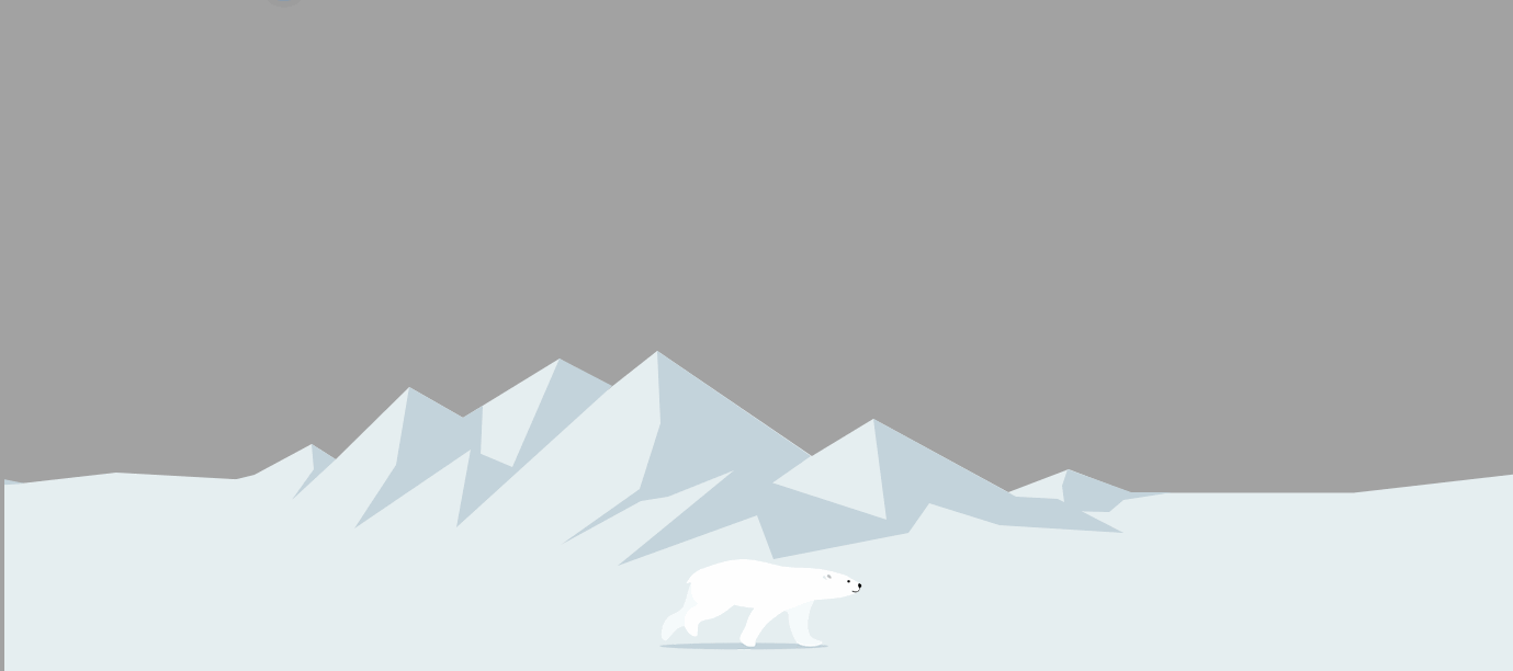
熊是 8 张连续的图, 通过播放组成动画
|
||
|
||
* 总长度 1600, 除以 8, 对应 bear 盒子的宽度 200, 每次把一张动画显示到背景里
|
||
* 因为是相对定位, move 动画把熊移动到屏幕中间
|
||
|
||
<img src="https://img.081024.xyz/bear.png" alt="熊" style="background-color: black; padding: 10px;">
|
||
|
||
背景的山
|
||
|
||
* 总长度 3840
|
||
* 动画延迟 3 秒, 对应熊跑到中间的时间
|
||
|
||
<img src="https://img.081024.xyz/mountain.png" alt="山" style="background-color: black; padding: 10px;">
|
||
|
||
效果:
|
||
|
||
|
||
|
||
## supports
|
||
|
||
@supports是CSS3新引入的规则之一,主要用于检测当前浏览器是否支持某个CSS属性并加载具体样式.
|
||
|
||
基本使用方式:
|
||
|
||
```css
|
||
@supports (display: grid) {
|
||
.container {
|
||
color: red;
|
||
}
|
||
}
|
||
12345
|
||
```
|
||
|
||
类似@media媒体查询,当浏览器支持`display:grid`这个CSS属性时才应用其中的样式
|
||
|
||
所以上述代码比如在IE9下就不会显示为红色字体。
|
||
|
||
主要用在防止旧浏览器不支持某些属性造成排版混乱的情况,使用@supports当做备选项。
|
||
|
||
此外,还支持逻辑运算符;not, and, or
|
||
|
||
例如
|
||
|
||
```css
|
||
@supports not(display: grid){...}
|
||
@supports (display: grid) and (position: sticky){...}
|
||
@supports (display: grid) or (display: flex){...}
|
||
123
|
||
```
|
||
|
||
括号内不一定都要是"关键字",只要是CSS语法都可以,比如:
|
||
|
||
```css
|
||
@supports (border-radius: 4px) or (--btn-color: red){...}
|
||
1
|
||
```
|
||
|
||
上面就表示支持border-radius或者css variables就会加载其中的样式
|
||
|
||
js中也可以调用类似的方法:
|
||
|
||
```js
|
||
if(CSS.supports('display', 'grid')){
|
||
alert('it support!')
|
||
}
|
||
|
||
123
|
||
```
|
||
|
||
个很矛盾的地方,就是这个属性基本只有在"高级"浏览器下才会是生效,但"高级"浏览器的支持范围又支持大部分的CSS属性,所以把他当做一个"低级"浏览器检测器倒是个不错的选择 |